

Back in 2001 when I entered university to study Statistics, our professor told us that “Statistics is a perfect way to tell lies“. This “quote” got my attention and I totally agree with that. I can confirm that I have seen many statistical analyses with a totally opposite statistical inference, sometimes the misleading statistical inference is on purpose, and sometimes is because the analyst does not take into consideration all the parameters. A good example of misleading inference that can be generated by misapplied statistics is Simpson’s Paradox which we are going to explain with some examples.
Simpson’s Paradox
Simpson’s paradox is a phenomenon encountered in the field of probability and statistics in which a trend appears in different groups of data but disappears or reverses when we aggregate the data and treat it as a unique group. Below we will represent reproducible examples of Simpson’s Paradox.
Simpson’s Paradox and Correlation
A nice example of Simpson’s paradox is the case where some or even all the groups of data have a strong positive or negative correlation and when we combined all the groups, then the data appears to have the reverse correlation. Let’s provide a concrete example in R
Example
We will generate the following correlated data from the Multivariate Normal Distribution (2-D). You can find a good explanation of Bivariate Normal Distribution and the relationship between the variance-covariance sigma matrix and the correlation.
- Group 1: 1000 pairs with covariance -0.7, mean (0,0), variance (2,2) and correlation -0.7/sqrt(2 x 2) = -0.35
- Group 2: 1000 pairs with covariance -0.7, mean (3,3), variance (2,2) and correlation -0.7/sqrt( 2 x 2) = -0.35
- Group 3: 1000 pairs with covariance -0.7, mean (6,6), variance (3,3) and correlation -0.7/sqrt(3 x 3) = -0.23
library(MASS)
library(tidyverse)

set.seed(5)
### build the g1

mu<-c(0,0)

sigma<-rbind(c(2,-0.7),c(-0.7,2) )

g1<-as.data.frame(mvrnorm(n=1000, mu=mu, Sigma=sigma))

g1$group<-c("Group 1")


### build the g2


mu<-c(3,3)

sigma<-rbind(c(2,-0.7),c(-0.7,2) )

g2<-as.data.frame(mvrnorm(n=1000, mu=mu, Sigma=sigma))

g2$group<-c("Group 2")

### build the g3


mu<-c(6,6)

sigma<-rbind(c(3,-0.7),c(-0.7,3) )

g3<-as.data.frame(mvrnorm(n=1000, mu=mu, Sigma=sigma))

g3$group<-c("Group 3")


# the combined data of all three groups
df<-rbind(g1,g2,g3)
Let’s see the combined data of the three groups:
df%>%ggplot(aes(x=V1, y=V2))+geom_point()+ geom_smooth(method='lm')
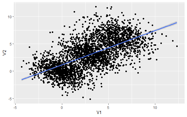
As we can see there is a clear positive correlation between V1 and V2 with a correlation 0.6285 (cor(df[,c(1,2)])). Thus, someone can infer that the data are positively correlated. But as we said earlier, we generated negatively correlated data. Let’s see the same data but with a different angle of view, this time by taking into consideration each group.
df%>%ggplot(aes(x=V1, y=V2, group=group, col=group))+geom_point()+ geom_smooth(method='lm', col='black')
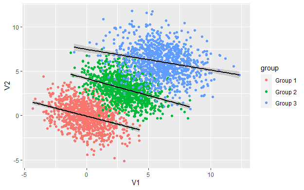
As we can see, within each group the relationship between V1, V2 is negative but when we combined the data the relationship appears to be positive. This is one example of Simpson’s paradox.
An example of such a case in the real-world is when we want to examine the correlation between two KPIs like CTR and CR between variants for one campaign which runs for many days. If there is a day-of-week effect (e.g. Saturday and Sunday less responsive days) and we measure the results by variant and date, then it is quite likely to appear that are strongly positive correlated although within each day are not.
Simpson’s Paradox and Ratios
I have encountered many times Simpson’s paradox when I am dealing with ratios. It is possible for a particular attribute to have a higher rate in every single group but not when you combined all the data. It sounds strange no? That’s is why we call it a “paradox”. Let me provide a concrete example.
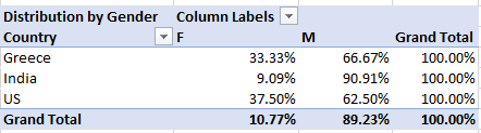
Scenario: Let’s assume that I run a Facebook campaign for my blog Predictive Hacks using Click on the page as a KPI. The results were based on Country and Gender and can be found below:
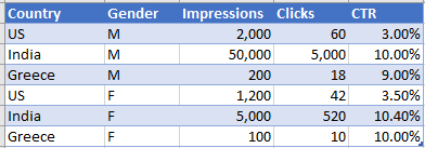
As we can see from the data above, in every country, the CTR of Females (Gender=F) was higher than that of Males (Gender=M). In the US it was 3.5% vs 3%, in India 10.4% vs 10% and in Greece 10% vs 9%. However, when we combined all the countries and we get the CTR by Gender we get the following results:
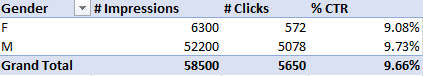
When we aggregate the results the Males appear to have a higher CTR than the Females (9.73% vs 9.08%). This is another clear example of how we can drive totally different results when we are dealing with ratios.
What was the cause of Simpson’s paradox above? The issue was that the distribution of Males vs Females was not the same across countries
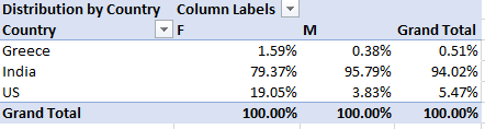
In addition, the CTR was not the same across Countries. So, in India, the CTR was much higher than that of the US and the proportion of Males was much higher compared to the other two countries. As a result, the CTR of the Male Indians had a bigger weight on the overall data and skewed the CTR of the whole Male group. This becomes clearer when we look at the distribution of each Gender by Country:
In India, which is the most responsive country, men account for 95.79% of the total Impressions. On contrary, women account for 79.37% of the total Impressions.
Vector interpretation of Simpson’s Paradox
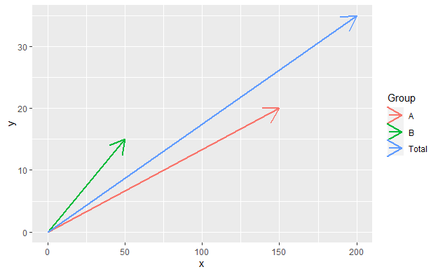
Simpson’s paradox can also be illustrated using the 2-dimensional vector space. A CTR of x/n where x is the clicks and n is the impressions can be represented by a vector (n,x) with a slope of x/n which is the tangent that indicates the CTR, the steeper the vector the greater the CTR and vice versa. If two rates x1/n1 and x2/n2 are combined then the combined vector is the overall CTR and according to parallelogram rule is (n1+n2, x1+x2) with slope equal to (x1+x2)/(n1+n2). Let’s represent the 2-D vector space in R.
Assume that we are dealing with the following data:
####
df<-data.frame(Group = c("A","B"),
               Impressions = c(150, 50),
               Clicks = c(20, 15)
               )

df_total = data.frame(Group = c("Total"),
                      Impressions = sum(df$Impressions),
                      Clicks = sum(df$Clicks)
)

df<-rbind(df, df_total)
df<-df%>%mutate(CTR=Clicks/Impressions)
df
  Group Impressions Clicks       CTR
1     A         150     20 0.1333333
2     B          50     15 0.3000000
3 Total         200     35 0.1750000
The CTR of Group A is 13.33% the CTR of Group B is 30% and the aggregated CTR is 17.5%. We can see that because Group A has much more impressions than Group B it gives more weight to the overall CTR. Let’s show this in R using ggplot:
ggplot() + geom_segment(data=df, mapping = aes(x=0, y=0, xend=Impressions, yend=Clicks))
A Famous Example of Simpson’s Paradox
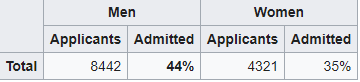
UC Berkeley gender bias
The table below shows the admission rates for the fall of 1973 by Gender. Someone can easily claim that there is an issue with gender equality since the admission rate of men was much higher than that of women (44% vs 35%)
However, when examining the individual departments, it appeared that 6 out of 85 departments were significantly biased against men, whereas 4 were significantly biased against women.
The data from the six largest departments are listed below:
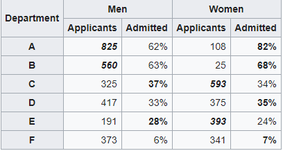
The research paper by Bickel et al.[15] concluded that women tended to apply to more competitive departments with low rates of admission even among qualified applicants (such as in the English Department), whereas men tended to apply to less competitive departments with high rates of admission among the qualified applicants.
Sum Up
Simpson’s paradox is often encountered in Social-Science and Medical-Science and recently is quite common in Web Analytics where the KPI is usually a ratio like a conversion rate, click-through rate, cost per click, cost per impression, view rate, bounce rate etc. We have to be very careful when we make a statistical inference and we need to take into consideration all the parameters.