This post is about COVID-19 and we will an example of how you can get the data of the daily “confirmed”, “recovered” and “death” cases by country. In essence, we will show you how you can have access to the data used by Johns Hopkins Report and you can easily run your own reports and analysis.
The coronavirus package provides detailed information. Let’s give some examples of what reports we can generate. Notice, that the R-package is updated on a daily basis, so you have to re-install for the new data.
Let’s have a look at the column names of the coronavirus dataset:
# https://github.com/RamiKrispin/coronavirus
devtools::install_github("RamiKrispin/coronavirus")
#checks if there is data update on the Github version
coronavirus::update_datasets(silence = TRUE)

library(coronavirus)
library(tidyverse)
library(lubridate)

data("coronavirus")

str(coronavirus)
head(coronavirus)
> str(coronavirus)
Classes ‘tbl_df’, ‘tbl’ and 'data.frame':	3152 obs. of  7 variables:
 $ Province.State: chr  "" "" "" "Anhui" ...
 $ Country.Region: chr  "Japan" "South Korea" "Thailand" "Mainland China" ...
 $ Lat           : num  36 36 15 31.8 40.2 ...
 $ Long          : num  138 128 101 117 116 ...
 $ date          : Date, format: "2020-01-22" "2020-01-22" "2020-01-22" "2020-01-22" ...
 $ cases         : int  2 1 2 1 14 6 1 26 2 1 ...
 $ type          : chr  "confirmed" "confirmed" "confirmed" "confirmed" ...
head(coronavirus)
#> Province.State Country.Region Lat Long date cases type
#> 1 Japan 36.0000 138.0000 2020-01-22 2 confirmed
#> 2 South Korea 36.0000 128.0000 2020-01-22 1 confirmed
#> 3 Thailand 15.0000 101.0000 2020-01-22 2 confirmed
#> 4 Anhui Mainland China 31.8257 117.2264 2020-01-22 1 confirmed
#> 5 Beijing Mainland China 40.1824 116.4142 2020-01-22 14 confirmed
#> 6 Chongqing Mainland China 30.0572 107.8740 2020-01-22 6 confirmedGet the Top 10 Countries in Confirmed Cases
coronavirus %>%
  select(country = Country.Region, type, cases) %>%
  group_by(country, type) %>%
  summarise(total_cases = sum(cases)) %>%
  pivot_wider(names_from = type,
              values_from = total_cases) %>%
  arrange(-confirmed)%>%head(10)
   country        confirmed death recovered
   <chr>              <int> <int>     <int>
 1 Mainland China     80652  3070     55478
 2 South Korea         7041    44       135
 3 Italy               5883   233       589
 4 Iran                5823   145      1669
 5 France               949    11        12
 6 Germany              799    NA        18
 7 Others               696     6        40
 8 Spain                500    10        30
 9 Japan                461     6        76
10 US                   417    17         8
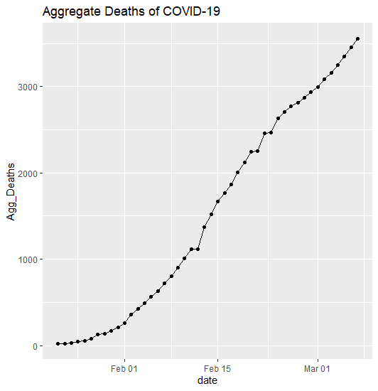
Get the Daily and Aggregated Deaths
death_report<-coronavirus%>%filter(type=="death")%>%group_by(date)%>%summarise(Daily_Deaths=sum(cases))%>%
  ungroup()%>%mutate(Agg_Deaths=cumsum(Daily_Deaths))

death_report
| Date | Daily_Deaths | Agg_Deaths |
| 1/22/2020 | 17 | 17 |
| 1/23/2020 | 1 | 18 |
| 1/24/2020 | 8 | 26 |
| 1/25/2020 | 16 | 42 |
| 1/26/2020 | 14 | 56 |
| 1/27/2020 | 26 | 82 |
| 1/28/2020 | 49 | 131 |
| 1/29/2020 | 2 | 133 |
| 1/30/2020 | 38 | 171 |
| 1/31/2020 | 42 | 213 |
| 2/1/2020 | 46 | 259 |
| 2/2/2020 | 103 | 362 |
| 2/3/2020 | 64 | 426 |
| 2/4/2020 | 66 | 492 |
| 2/5/2020 | 72 | 564 |
| 2/6/2020 | 70 | 634 |
| 2/7/2020 | 85 | 719 |
| 2/8/2020 | 87 | 806 |
| 2/9/2020 | 100 | 906 |
| 2/10/2020 | 107 | 1013 |
| 2/11/2020 | 100 | 1113 |
| 2/12/2020 | 5 | 1118 |
| 2/13/2020 | 253 | 1371 |
| 2/14/2020 | 152 | 1523 |
| 2/15/2020 | 143 | 1666 |
| 2/16/2020 | 104 | 1770 |
| 2/17/2020 | 98 | 1868 |
| 2/18/2020 | 139 | 2007 |
| 2/19/2020 | 115 | 2122 |
| 2/20/2020 | 125 | 2247 |
| 2/21/2020 | 4 | 2251 |
| 2/22/2020 | 207 | 2458 |
| 2/23/2020 | 11 | 2469 |
| 2/24/2020 | 160 | 2629 |
| 2/25/2020 | 79 | 2708 |
| 2/26/2020 | 62 | 2770 |
| 2/27/2020 | 44 | 2814 |
| 2/28/2020 | 58 | 2872 |
| 2/29/2020 | 69 | 2941 |
| 3/1/2020 | 55 | 2996 |
| 3/2/2020 | 89 | 3085 |
| 3/3/2020 | 75 | 3160 |
| 3/4/2020 | 94 | 3254 |
| 3/5/2020 | 94 | 3348 |
| 3/6/2020 | 112 | 3460 |
| 3/7/2020 | 98 | 3558 |
death_report%>%ggplot(aes(x=date, Agg_Deaths))+
               geom_point()+geom_line()+
               ggtitle("Aggregate Deaths of COVID-19")
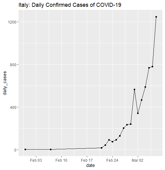
Get the Daily Confirmed Cases of Italy
coronavirus%>%filter(Country.Region=="Italy", type=="confirmed")%>%
  group_by(date)%>%summarise(daily_cases=sum(cases))%>%ungroup()%>%
  mutate(agg_cases=cumsum(daily_cases))
   date       daily_cases agg_cases
   <date>           <int>     <int>
 1 2020-01-31           2         2
 2 2020-02-07           1         3
 3 2020-02-21          17        20
 4 2020-02-22          42        62
 5 2020-02-23          93       155
 6 2020-02-24          74       229
 7 2020-02-25          93       322
 8 2020-02-26         131       453
 9 2020-02-27         202       655
10 2020-02-28         233       888
11 2020-02-29         240      1128
12 2020-03-01         566      1694
13 2020-03-02         342      2036
14 2020-03-03         466      2502
15 2020-03-04         587      3089
16 2020-03-05         769      3858
17 2020-03-06         778      4636
18 2020-03-07        1247      5883
If we want also to make a chart:
coronavirus%>%filter(Country.Region=="Italy", type=="confirmed")%>%
  group_by(date)%>%summarise(daily_cases=sum(cases))%>%ungroup()%>%
  mutate(agg_cases=cumsum(daily_cases))%>%
  ggplot(aes(x=date, y=daily_cases))+geom_line()+geom_point()+ggtitle("Italy: Daily Confirmed Cases of COVID-19")
Updated
Our goal was to show how someone can get the COVID-19 data and run his/her own analysis. Since we gathered more data, let’s have a look at some reports.
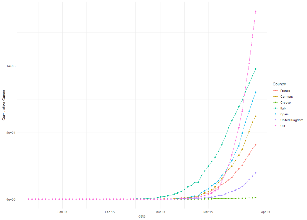
Cumulative Cases
coronavirus%>%mutate(date=as.Date(date))%>%rename(Country=Country.Region)%>%
  filter(Country %in% c("Italy","US","Greece","Spain", "France", "United Kingdom", "Germany"), type=="confirmed")%>%
  group_by(date, Country)%>%summarise(Daily_Cases=sum(cases))%>%group_by(Country)%>%arrange(date)%>%
  mutate(Agg_Cases=cumsum(Daily_Cases))%>%
  ggplot(aes(x=date, y=Agg_Cases, col=Country))+geom_point()+geom_line()+ylab("Cumulative Cases")+theme_minimal()
Summary Table
cases_tb<-coronavirus%>%mutate(date=as.Date(date))%>%rename(Country=Country.Region)%>%
  filter(Country %in% c("Italy","US","Greece","Spain", "France", "United Kingdom", "Germany"), type=="confirmed")%>%
  group_by(date, Country)%>%summarise(Daily_Cases=sum(cases))%>%group_by(Country)%>%arrange(date)%>%
  mutate(Agg_Cases=cumsum(Daily_Cases), Diff=Daily_Cases/lag(Daily_Cases)-1)%>%arrange(desc(date))%>%slice(1)%>%select(date, Country, Agg_Cases, Yestrday_Case=Daily_Cases, Change_in_Daily_Cases=Diff)


death_tb<-coronavirus%>%mutate(date=as.Date(date))%>%rename(Country=Country.Region)%>%
  filter(Country %in% c("Italy","US","Greece","Spain", "France", "United Kingdom", "Germany"), type=="death")%>%
  group_by(date, Country)%>%summarise(Daily_Cases=sum(cases))%>%group_by(Country)%>%arrange(date)%>%
  mutate(Agg_Cases=cumsum(Daily_Cases), Diff=Daily_Cases/lag(Daily_Cases)-1)%>%arrange(desc(date))%>%slice(1)%>%select(date, Country, Agg_Deaths=Agg_Cases, Yestrday_Deaths=Daily_Cases, Change_in_Daily_Deaths=Diff)


final<-cases_tb%>%inner_join(death_tb, by = c("date", "Country"))%>%mutate(Death_Rate=Agg_Deaths/Agg_Cases)

final
# A tibble: 7 x 9
# Groups:   Country [7]
  date       Country       Agg_Cases Yestrday_Case Change_in_Daily_Cas~ Agg_Deaths Yestrday_Deaths Change_in_Daily_Deat~ Death_Rate
  <date>     <chr>             <int>         <int>                <dbl>      <int>           <int>                 <dbl>      <dbl>
1 2020-03-29 France            40708          2603              -0.447        2611             294              -0.0813     0.0641
2 2020-03-29 Germany           62095          4400              -0.355         533             100               0.0989     0.00858
3 2020-03-29 Greece             1156            95               0              38               6               0.5        0.0329
4 2020-03-29 Italy             97689          5217              -0.127       10779             756              -0.150      0.110
5 2020-03-29 Spain             80110          6875              -0.0853       6803             821              -0.0273     0.0849
6 2020-03-29 United Kingd~     19780          2468              -0.0386       1231             210              -0.192      0.0622
7 2020-03-29 US               140886         19408              -0.0208       2467             441              -0.00899    0.0175
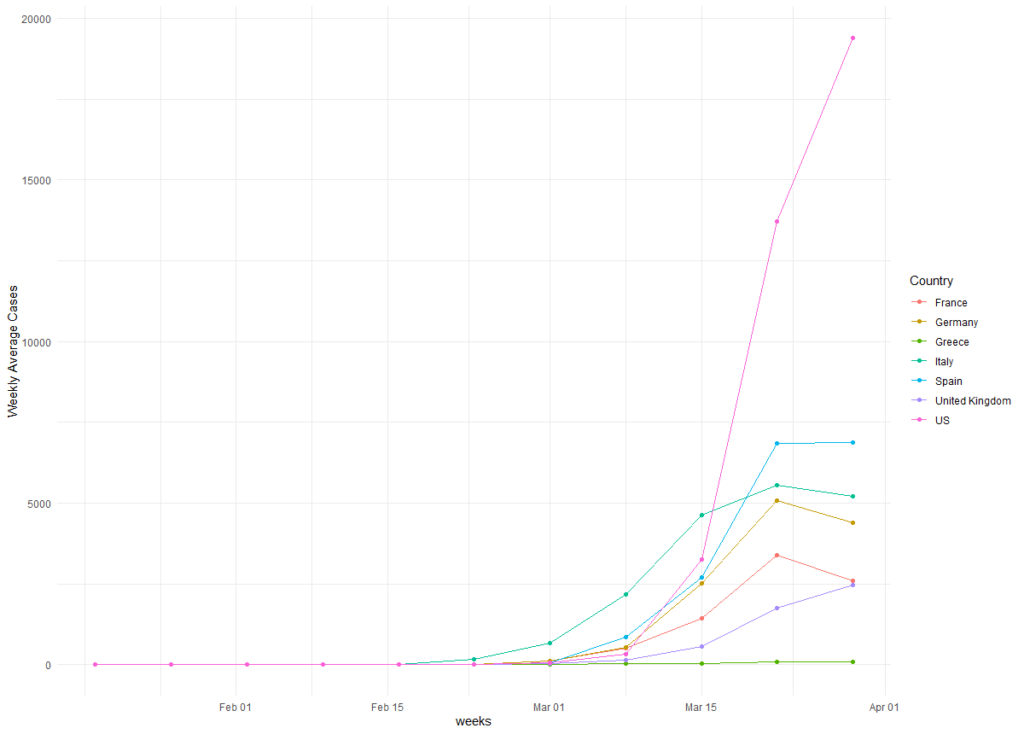
Weekly New Cases
We have heard the term “flatten the curve”. In essence, we want the New Cases not to increase exponentially and of course, we prefer to see the new cases to decrease across time. Let’s have a look at the “Weekly Average New Cases“
coronavirus%>%filter(type=="confirmed", Country.Region %in% c("Italy","US","Greece","Spain", "France", "United Kingdom", "Germany"))%>%
  mutate(date=as.Date(date), weeks = floor_date(date, "weeks"))%>%group_by(Country.Region,weeks)%>%
  summarise(weekly_cases=sum(cases), avg_daily=round(sum(cases)/length(unique(date))))%>%rename(Country=Country.Region)%>%ggplot(aes(x=weeks, y=avg_daily, col=Country))+geom_line()+geom_point()+ylab("Weekly Average Cases")+theme_minimal()
Discussion
Since you have access to the daily cases of COVID-19 by Country, you can run your own analysis and projections about the progress of the virus. Would it be finally an epidemic, do you agree with the analysis of the Australian National University where based on their best case scenario 15 million people will eventually die from COVID-19?

