
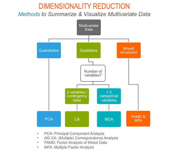
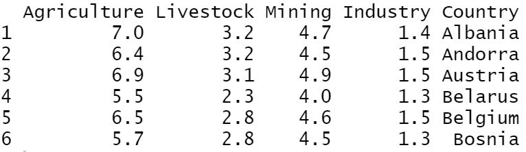
In this tutorial, we will work with the factoextra R package and we will consider the Country dataset. Let’s start:
library(factoextra)

df<-read.csv("DataCountries.txt", sep="\t")

head(df)
PCA Analysis
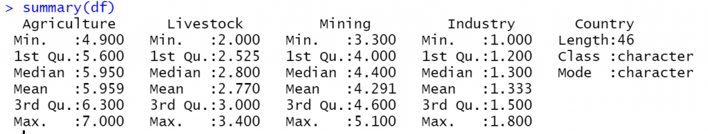
Now we will run a PCA analysis on our dataset. Note that we need to include only the numeric variables. We will also set as row names the column Country.
# set as rownames the column Country
rownames(df)<-df$Country

# remove the Countrly columns
df$Country<-NULL

# run a PCA Analysis
dfPCA <- prcomp(df, center = TRUE, scale. = TRUE)
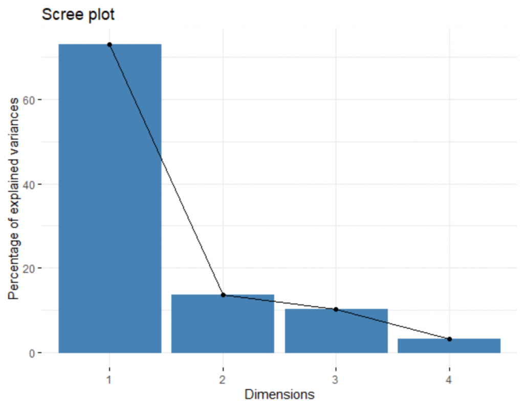
Let’s get Scree plot which shows the percentage of explained variance by Principal Component.
fviz_eig (dfPCA)
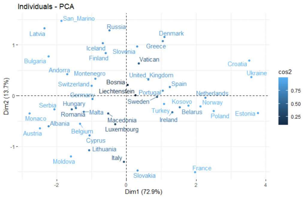
Graph of Individual
Let’s plot all the countries into two dimensions by taking into consideration the quality of the individuals on the factor map.
# cos2 = the quality of the individuals on the factor map
# Select and visualize some individuals (ind) with select.ind argument.
 # - ind with cos2 >= 0.96: select.ind = list(cos2 = 0.96)
 # - Top 20 ind according to the cos2: select.ind = list(cos2 = 20)
 # - Top 20 contributing individuals: select.ind = list(contrib = 20)
 # - Select ind by names: select.ind = list(name = c("23", "42", "119") )

fviz_pca_ind(dfPCA, col.ind = "cos2" , repel = TRUE)
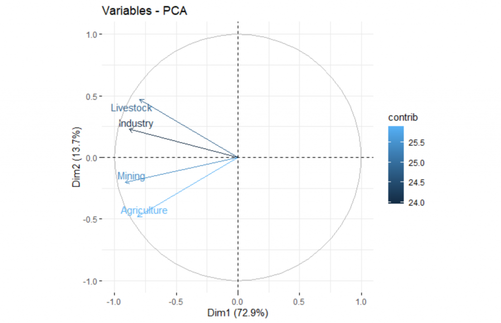
Graph of Variables
Let’s see how we can represent the variables into two dimensions by taking into account their contribution.
#  select.var = list(contrib = 15)

fviz_pca_var(dfPCA, col.var = "contrib", repel = TRUE)
Graph of the Biplot
# Graph of the Biplot
fviz_pca_biplot(dfPCA, repel = TRUE)

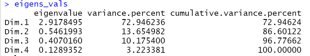
Eigenvalues, Variables and Individuals
Let’s see how we can get the Eigenvalues and statistics for Variables and Individuals such as the Coordinates, the Contributions to the PCs and the Quality of representation
Eigenvalues
# Eigenvalues
eigens_vals <- get_eigenvalue(dfPCA)
eigens_vals
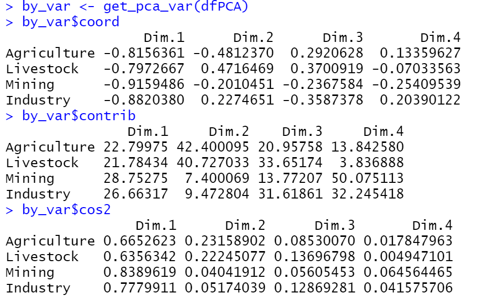
Variables
# By Variable
by_var <- get_pca_var(dfPCA)
by_var$coord
by_var$contrib
by_var$cos2
Individuals
# By ndividual
by_ind <- get_pca_ind(dfPCA)
by_ind$coord
by_ind$contrib
by_ind$cos2


2 thoughts on “How to Visualize Multivariate Data Analysis”
Nice process, but I miss interpretation and explanation.
Hi everyone,
I would like to know how I can add text for each point in the graph created by this function.
Thanks in advance,