
We will work with the Breast Cancer Wisconsin dataset, where we will apply the K-Means algorithm to the individual’s features ignoring the dependent variable diagnosis. Notice that all the features are numeric.
library(tidyverse)


# the column names of the dataset
names <- c('id_number', 'diagnosis', 'radius_mean',
           'texture_mean', 'perimeter_mean', 'area_mean',
           'smoothness_mean', 'compactness_mean',
           'concavity_mean','concave_points_mean',
           'symmetry_mean', 'fractal_dimension_mean',
           'radius_se', 'texture_se', 'perimeter_se',
           'area_se', 'smoothness_se', 'compactness_se',
           'concavity_se', 'concave_points_se',
           'symmetry_se', 'fractal_dimension_se',
           'radius_worst', 'texture_worst',
           'perimeter_worst', 'area_worst',
           'smoothness_worst', 'compactness_worst',
           'concavity_worst', 'concave_points_worst',
           'symmetry_worst', 'fractal_dimension_worst')

# get the data from the URL and assign the column names
df<-read.csv(url("https://archive.ics.uci.edu/ml/machine-learning-databases/breast-cancer-wisconsin/wdbc.data"), col.names=names)
Scale your Data
Before we apply any cluster analysis, we should scale our data. We will remove the id_number and the diagnosis
scaled_data<-as.data.frame(scale(df%>%select(-id_number, -diagnosis)))
Elbow Method
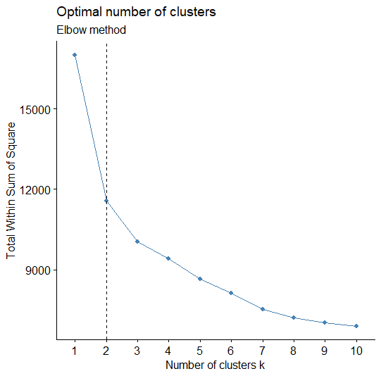
In a previous post, we explained how we can apply the Elbow Method in Python. Here, we will use the map_dbl to run kmeans using the scaled_data for k values ranging from 1 to 10 and extract the total within-cluster sum of squares value from each model. Then we can visualize the relationship using a line plot to create the elbow plot where we are looking for a sharp decline from one k to another followed by a more gradual decrease in slope. The last value of k before the slope of the plot levels off suggests a “good” value of k.
# Use map_dbl to run many models with varying value of k (centers)
tot_withinss <- map_dbl(1:10,  function(k){
  model <- kmeans(x = scaled_data, centers = k)
  model$tot.withinss
})

# Generate a data frame containing both k and tot_withinss
elbow_df <- data.frame(
  k = 1:10,
  tot_withinss = tot_withinss
)


# Plot the elbow plot
ggplot(elbow_df, aes(x = k, y = tot_withinss)) +
  geom_line() + geom_point()+
  scale_x_continuous(breaks = 1:10)
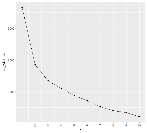
According to the Elbow Method, we can argue that the number of suggested K Clusters are 2.
Silhouette Analysis
Silhouette analysis allows you to calculate how similar each observation is with the cluster it is assigned relative to other clusters. This metric ranges from -1 to 1 for each observation in your data and can be interpreted as follows:
- Values close to 1 suggest that the observation is well matched to the assigned cluster
- Values close to 0 suggest that the observation is borderline matched between two clusters
- Values close to -1 suggest that the observations may be assigned to the wrong cluster
We can determine the number of clusters K using the average silhouette width. We pick the K which maximizes that score.
# Use map_dbl to run many models with varying value of k
sil_width <- map_dbl(2:10,  function(k){
  model <- pam(x = scaled_data, k = k)
  model$silinfo$avg.width
})

# Generate a data frame containing both k and sil_width
sil_df <- data.frame(
  k = 2:10,
  sil_width = sil_width
)

# Plot the relationship between k and sil_width
ggplot(sil_df, aes(x = k, y = sil_width)) +
  geom_line() + geom_point() +
  scale_x_continuous(breaks = 2:10)
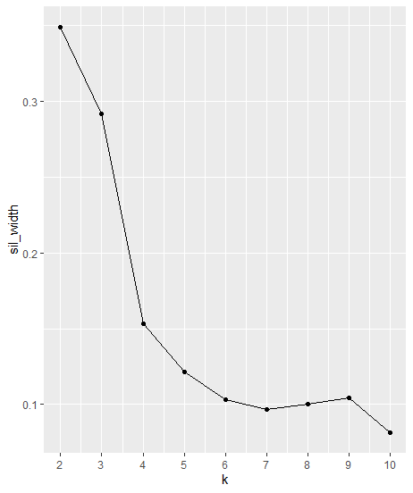
As we can see from the plot above, the “Best” k is 2
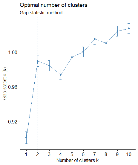
Gap Statistic
The gap statistic compares the total intracluster variation for different values of k with their expected values under null reference distribution of the data (i.e. a distribution with no obvious clustering). The reference dataset is generated using Monte Carlo simulations of the sampling process
library(factoextra)
library(cluster)
# compute gap statistic
set.seed(123)
gap_stat <- clusGap(scaled_data, FUN = kmeans, nstart = 25,
                    K.max = 10, B = 50)


fviz_gap_stat(gap_stat)
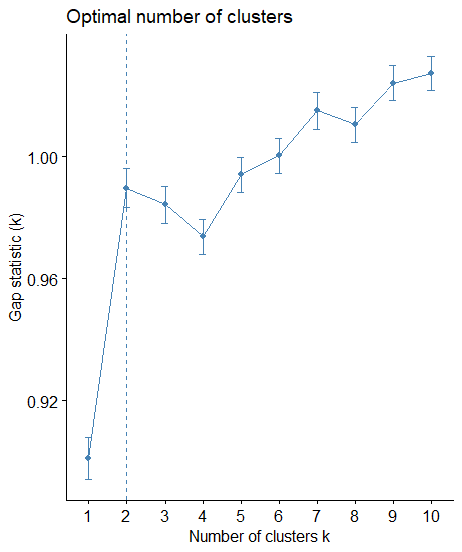
Again, according to the Gap Statistic, the optimum number of clusters is the k=2.
All 3 methods in one package
Let’s see how we can produce the same analysis for the three methods above with a few lines of coding!
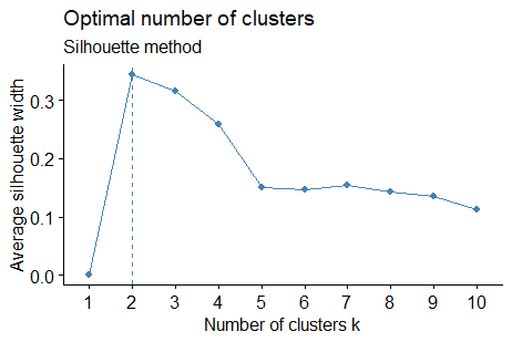
library(factoextra)
library(NbClust)


# Elbow method
fviz_nbclust(scaled_data, kmeans, method = "wss") +
  geom_vline(xintercept = 2, linetype = 2)+
  labs(subtitle = "Elbow method")

# Silhouette method
fviz_nbclust(scaled_data, kmeans, method = "silhouette")+
  labs(subtitle = "Silhouette method")

# Gap statistic
# nboot = 50 to keep the function speedy.
# recommended value: nboot= 500 for your analysis.
# Use verbose = FALSE to hide computing progression.
set.seed(123)
fviz_nbclust(scaled_data, kmeans, nstart = 25,  method = "gap_stat", nboot = 50)+
  labs(subtitle = "Gap statistic method")

Visualize the K-Means
Since we determined that the number of clusters should be 2, then we can run the k-means algorithm with k=2. Let’s visualize our data into two dimensions.
fviz_cluster(kmeans(scaled_data, centers = 2), geom = "point", data = scaled_date)

Clusters and Classes in the same plot
Based on the analysis above, the suggested number of clusters in K-means was 2. Bear in mind that in our dataset we have also the dependent variable diagnosis which takes values B and M. Let’s represent at the same plot the Clusters (k=2) and the Classes (B,M).
We will apply PCA by keeping the first two PCs.
# get the PCA of the scaled data
pca_res <- prcomp(scaled_data)

# add the Cluster to the original data frame
df$cluster<-as.factor(kmeans(scaled_date, centers = 2)$cluster)

# add the PC1 and PC2 to the original data frame
df$PC1<-pca_res$x[,1]
df$PC2<-pca_res$x[,2]

# do a scatter plot of PC1, PC2 with a color of cluster on a separate graph
# for diagnosis is M and B

ggplot(aes(x=PC1, y=PC2, col=cluster), data=df)+geom_point()+facet_grid(.~diagnosis)

As we can see the majority of patients with a “Benign” tumor were in the first cluster and the patients with a “Malignant” tumor at the second cluster.